Listening to color + Living with Art
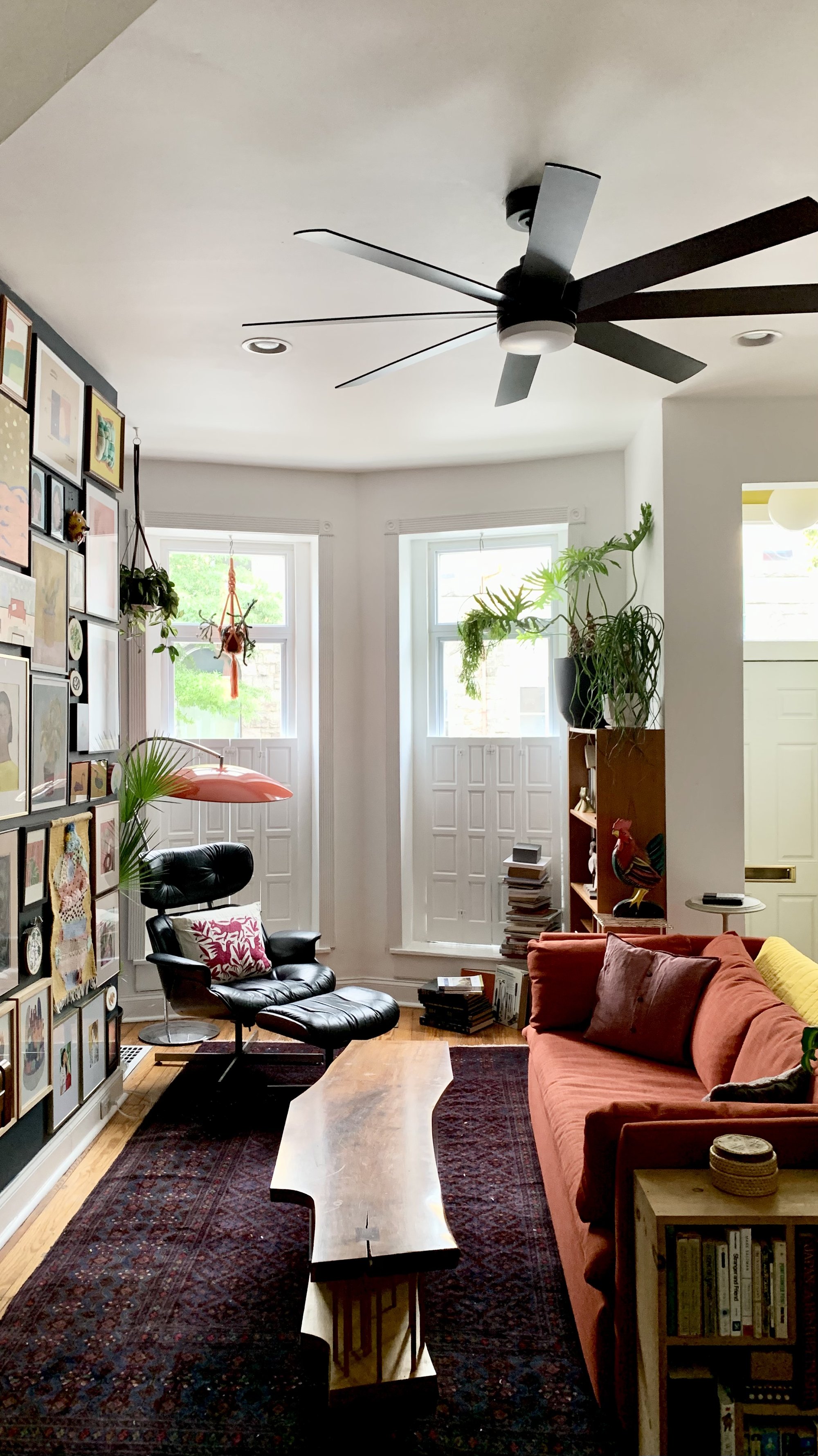
It’s no secret I like art. Dare I say it, I actually love art. So much so that I have built a career making it. I started collecting it at 15 when I received an owl painting from Baltimore artist, performer, and family friend Liz Downing for my birthday. Fast forward 17 years and here I am, back in Baltimore pinching myself that we get to live in this hundred year old row house in the middle of the city. For the past 6 months, as we have navigated our relocation, much of our art collection has been wrapped up, packed up, and in storage. We are finally settling into our new home and that means digging it all out.
As I worked on this wall, Davey asked me how I was making my decisions. The question caught me off guard and my first instinct was to say instinct, but that’s a super annoying answer and I think there is actually more to it than that. I needed to think on it, and since I was articulating it for us, I thought I’d share it with you too.
If you like to browse the internet about home/interiors (as I do), you may have come across a blog post or two about ‘how to perfectly/easily hang your gallery wall using templates/with perfect spacing/like a pro’ etc…this isn’t that. I’m not here to tell you the ‘right’ way to do anything (if you’ve ever done one of my patterns or joined me for a workshop, you’ll know I never presume to know the ‘right’ way). I am here to share a few of the guiding principles I rely on to organize my art collection. It isn’t necessarily the industry standard, but it's the method with which I've had best results, and the most fun. That last part is important.
Collecting
Take your time collecting art work that speaks to you. Nothing I say here is an endorsement or judgement of aesthetic and I think the underlying principles can apply to any collection in any space, whatever it all looks like. Live with what you like first and foremost.
Collect work within your budget. We have have prints and originals by contemporary artists as well as many thrifted and found pieces. If there is an artist’s work that you are really into, buy a piece as soon as you are able to afford it*—even if it’s small and even if it’s a print/reproduction. Because, 1) it feels great to tangibly and directly support artists and 2) chance are, over time, their prices will go up and you may not be in a position to afford the work you love in the future. This has happened to me so many times and while I kick myself for not investing when I could have, I’m always so pumped to see people building careers and finding a successful path.**
As you collect, start to recognize and articulate existing relationships between your pieces that can guide your curation.
*I know having a budget for art is a luxury and a privilege and, of course, collection should only come after immediate and essential needs/responsibilities are met. And I recognize that there are likely many artists that will never be within my/your collecting means—whatever that budget is. For example, the most expensive piece of artwork I have ever purchased was $650 and it was an enormous splurge for me that I saved up for over the course of several months. I know people who live with art that they spent thousands on—tens of thousands even (I used to nanny for a billionaire). And I know even more folks who save up for a small print. We are all in a different place when it comes to money and art. It’s a complicated and often uncomfortable topic. That being said, art in general is more widely accessible now than it ever has been in the history of the world. For those of us with access to the internet, art and artists are never more than a click away. Mixed feelings about social media aside, it has been an undeniably valuable tool for me to encounter other people’s work and to share my own.
**Money and pricing aren’t the only measures of creative/artistic success.
Color led the way.
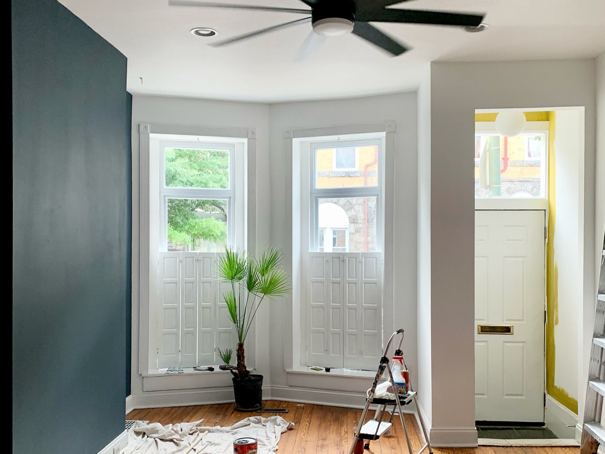
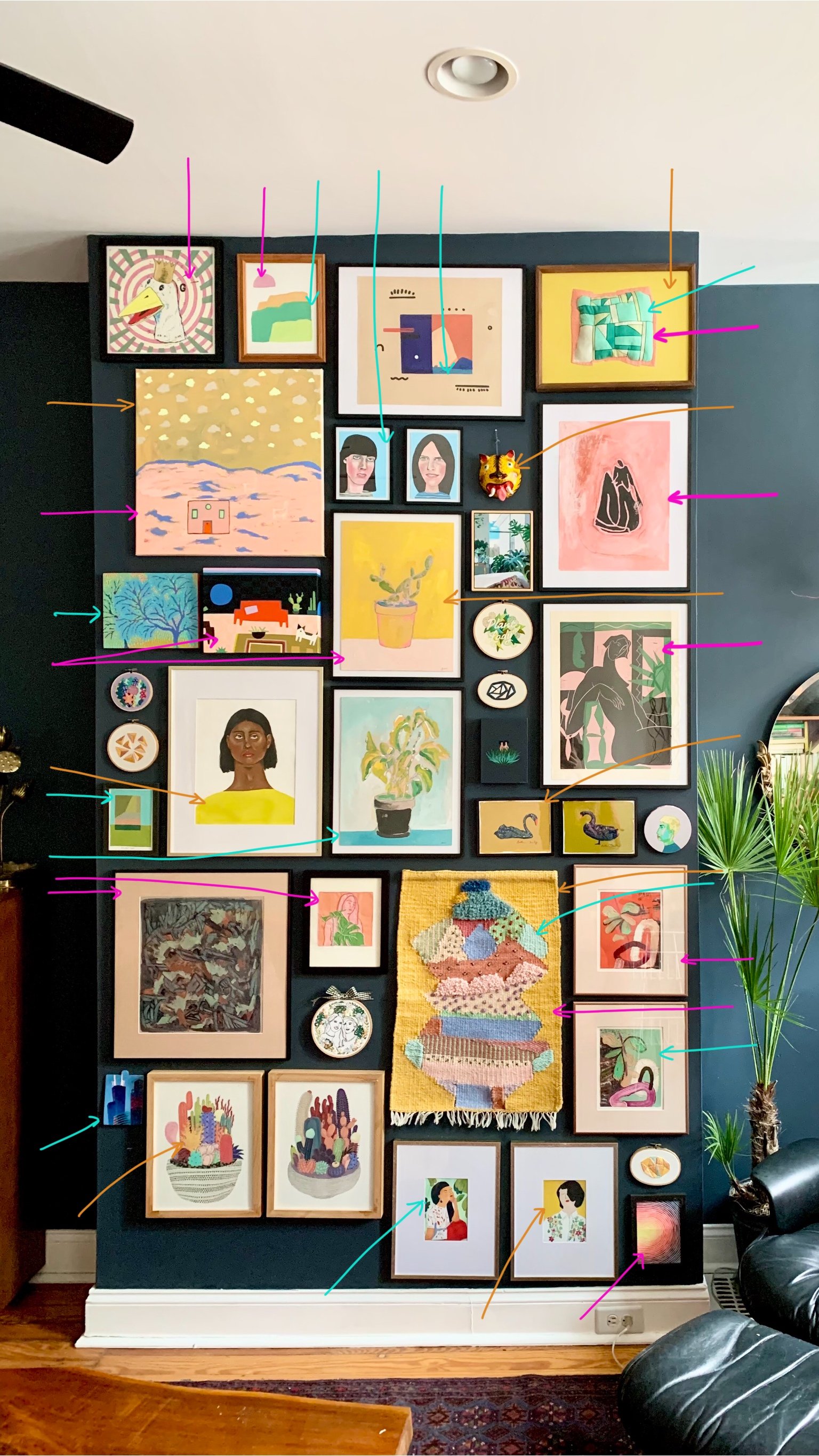
I surveyed our entire collection and pulled out all the pieces that contained a spectrum of mustard yellow, florescent pink, and an aqua-ish/turquoise-ish blue/green.
The consistent color relationship creates cohesion in an otherwise eclectic group of work—uniting the abstract with the representational, the paintings and the fiber art, and the large and small.
I didn’t set out with the agenda that color would be my organizing factor, but I noticed that my eye kept catching on the pinks, yellows, and minty-blues. The pieces were grouping themselves, and all I had to do was pay attention.
Listen to your instincts.
Layout
I don’t measure. I don’t use levels. And I don’t mind patching and touching up extra nail holes. I make my best decisions by just trying it, seeing if it works, and changing it up if I need to. I know this is definitely not everyone’s cup of tea and that’s ok. I’m here to give those who find the math, planning, and tools involved in ‘correctly’ executing a gallery wall overwhelming permission to wing it (as many times as you need to). My wall has a bit of wonk to it and that works for me.
How I actually hang pieces: like I have no respect for the wall whatsoever and with a hammer and small nails (the ones that come in a picture-hanging-kit you might find at Target or wherever). I know some folks like to make templates of their pieces with newsprint or craft paper to rearrange using tape to finalize their layout before committing to holes—some even go so far as to make rough sketches of the artworks or photos on the template paper. Respect to those folks, that’s not me.
I did try to lay everything out on the floor first so I could rearrange things before poking holes everywhere, but it turns out we don’t have enough open floor space. All the pieces were kind of piled on top of each other and the scale was wrong and it really confused me. Plus I found it very difficult to translate from horizontal to vertical, which was kind of interesting to think about, but frustrating to work through. So, I just went for it. I started in the middle and worked up and down from there. I tried to keep the spacing between pieces roughly the same, but I just eyeballed it.
composition
In order for the wall to feel balanced, here’s what I tried to do:
Disperse like-colors throughout the wall. For example, I wanted the mustard yellow to be evenly spread out across the wall rather than clumped together. This way the color leads your eye over the whole wall and things don’t feel lopsided.
Create a balance of large and small pieces. I spread the larger works out first, leaving gaps that could be filled in with smaller pieces. Some of those spaces for smaller works were horizontal and some vertical in order to, again, guide your eye in all directions.Hanging s few smaller pieces together also helps balance out the large pieces when you have a range of sizes like we do. It’s a puzzle.
If possible, use a variety of shapes and orientations throughout the wall. Circular pieces (like embroidery hoop art) are especially effective at punctuating the wall. I tried to spread these focal points out fairly evenly. You can also achieve variety by using a mix of square, portrait, and landscape shapes.
Curate intricate works next to more minimal pieces to give your eye a resting place. I think there are some areas in my final composition where this could be improved. Now that the wall is up, I know what I am looking for in this particular space if the right piece of art at the right price comes along at the right time.
Framing can unify or fracture a gallery wall. I don’t have the budget to re-frame all of our art to match. It is what it is and they were framed when/how they were framed. Eclectic framing doesn’t bother me, but it was one more factor to be mindful of for the overall composition. Only a few of these pieces are in wooden frames. I didn’t want to hang them all close together.
Crafting Home
I've come to realize that crafting our home is essentially an extension of my art practice--or maybe my embroidery has always been an extension of home. It's hard to say, but either way one informs the other.
I have always had a fascination with objects. I love the act of collecting. I love the way memory and emotion can be stored in precious items (from river rocks to family heirlooms) and how these objects can act as conduits recall loved ones, places, and experiences.
I love thinking about the blurred line between private and public that exists within the home (and studio). Personal spaces are rarely ever entirely personal—they are shared among family members, friends, and guests. Trades people come in and out. And now, with social media, an even wider audience is invited in. I often contemplate, “who is this for?” (The answer changes.) Same goes for creating work in the studio. Who is it for? (The answer changes.)
These thoughts and interests that have shaped my embroidered artworks for the past 10 years and the things I have discovered about myself through that work have in turn shaped the way I think about home.
Featured artists
I hope you’ll take a moment to check out these artists’ work. Obviously, I think they are great.
1) Bill Cass 2) Allie Biddle 3)David Esquivel 4) Me! A Puffy Patchwork, and a few hoops from 2013 5)April Nicole (they do share their work publicly anymore) 6) Isabella Di Sclafani 7) Reneesha McCoy 8) Sarah Ingraham 9) Sully Sherrod 10) Avery Williamson 11) Jeremy Miranda 12) Kelly Ryan 13) Gracie Ellison 14) Valeria Molinari 15) Sofia Salazar 16) Kristin Texeira 17) Laura Berger 18) Amy Wright 19) Sammy Millwood 20) Luna Muñoz 21) Katherine Dunlap 22) Jennifer Davis 23) Keenan Wells 24) Melinda Tracy Boyce (potted cactus pieces) 24) Teresa Lim (embroidered portrait. sorry for the double number, mistakes happen!) 25) *EDIT thanks to wonderful readers: Marine Futine [Previously: I wish I knew! Davey bought these as a gift for me from a vendor at a Renegade Craft fair, but the signature on the back of the prints is illegible—artists, sign your name so p[eople can read it!] 26) Melanie Lan
This post is not sponsored and none of these are affiliate links. I have purchased, been gifted, and traded for the art on this wall.


